
DOVE STICK
The texture of care.
For this film, we collaborated with Mechi López to create a visual world that expresses one of Dove’s most recognizable qualities: care. Rather than focusing on product performance alone, the challenge was to translate softness, purity, and skin comfort into materials, light, and motion while remaining unmistakably true to the brand’s visual identity.
Working closely with the creative team, we built the visual language around a simple but powerful idea: showing what the product contains and what it leaves out. This "in and out" logic became the driving concept of the piece, the ingredients that belong to the formula assemble the product's silhouette in positive space, while the ones intentionally left out shape that same silhouette in negative.
Each ingredient works as both a key product cue and a visual metaphor for protection and care, with soft gradients, flowing materials, and carefully choreographed motion creating a tactile world that communicates not only how the product feels, but what makes it work, and, just as deliberately, what it doesn't. Every surface, transition, and interaction was art directed to balance clarity with elegance, keeping the ingredients at the heart of the story while reinforcing Dove's distinctive sense of softness.
We developed the project in collaboration with the CG artist team at 1st Ave Machine BA, leading a large part of the R&D process that can be seen below. By letting the silhouette form and dissolve around each ingredient, the piece turns a functional message (what's in, what's out) into a collection of cinematic visuals that balance ingredient storytelling with emotional resonance, celebrating texture, movement, and the quiet beauty of everyday care.


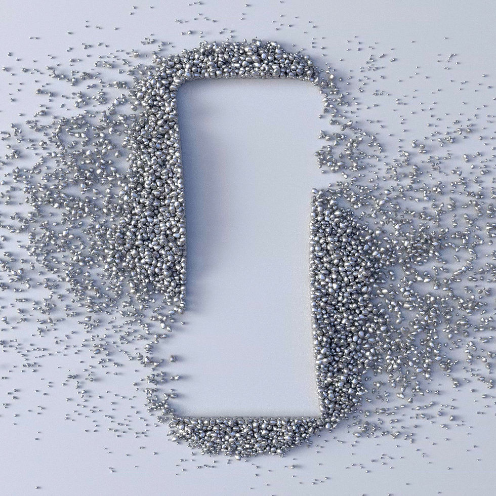


Exploring materials through simulations
Credits
Client: Dove - Unilever | Directors: Bleed & Mechi López
Production: 1st Ave Machine BA | Agency: Ogilvy UK